CUSTOMIZING PAGE DESIGNER FOR SALESFORCE COMMERCE CLOUD (SFCC)

Maintaining consistency always presents a challenge for Salesforce Commerce Cloud developers, especially when we talk about page templates, decorators or content inside of them. For an easier overview of design, Page Designer (PD in further text) has been introduced to SFCC. In this guide, I will show you how to enable and set up PD for your SFCC project and empower your customers business team to create beautiful and impactful content, fast.

BENEFITS OF A PAGE DESIGNER

Whether your customers are using SiteGenesis or RefArch, PD is there to help you reduce the developer dependency, improve the speed of the market and significantly lower the Quality Assurance time. If your storefront has a need for marketing content, heavy pages PD can help elevate your productivity by focusing on the key concepts and rules by which the designed pages will work. With PD you can create and manage pages, drag & drop content, preview the current state your page is in, create reusable components which will skyrocket the marketing level of your storefront.


PRE-REQUISITES:


ANATOMY OF A PAGE DESIGNER

When talking about the anatomy of the PD, three words stand out page type, layout and component. These are also the core of PD concept and logic. Let's see what each of them represents so you could have a clear understanding of the entire idea. All these files represent a code description of a component, together with its logic as an enclosed unit.


layout


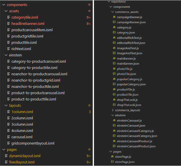
Page type - We design our page types here. In the picture you can see there are fixed layout and dynamic layout. This is where you define the main purpose of the page.

Layouts - Custom made templates, tailored by customers’ requirements and with the potential to be reused. They represent containers in which you will nest your content/assets.

Assets - Pieces of content, made to be as modular as possible so they can represent their use in the best possible way in closed up segment (product tile, grid tile, layout element… )


In the right picture there are descriptions of your components or pages, .json defining their regions, attribute groups, component types that are allowed to be embedded inside a layout/page. While .js defines the render function, the way your component/page will be rendered and with what properties, data, links, rules, etc. and since render returns the actual markup of the page, this method is mandatory.

Of course the actual look of the components is done through css, styling and aligning your layout as you see fit.


BUILDING A CUSTOM PAGE TYPE WITH COMPONENTS

To start this customization, I will add hooks.json to my cartridge with the following hook and, afterwards, I will define the page designer hook.js which will return info if page is in edit mode:

<your_cartridge>/cartridges/<your_cartridge>/hooks.json

{
    "Hooks": [
        {
            "name": "app.experience.editmode",
            "script": "./cartridge/experience/hooks.js"
        }
    ]
}


<your_cartridge>/cartridges/<your_cartridge>/cartridge/experience/hooks.js

function editmode() {
    session.privacy.consent = true; // eslint-disable-line no-undef
}

exports.editmode = editmode;

Another thing we need to do is add breakpoints.json for the responsive part of the page:

<your_cartridge>/cartridges/<your_cartridge>/cartridge/experience/breakpoints.json

{
    "mobile"  : 768,
    "tablet"  : 1024,
    "desktop" : 1440
}

The hierarchy in your folders should look like this:

Image removed.


First of all we need a custom page type. So, I will add the following files and explain what is happening:


  1.  We need a template for our custom page type:

practicePage.isml

<iscontent type="text/html" charset="UTF-8" compact="true" />
<div class="storepage" id="${pdict.page.ID}">

    <isdecorate template="common/layout/pdStorePage">
        <isscript>
            var assets = require('*/cartridge/scripts/assets.js');
            assets.addCss('/css/experience/storePage.css');
        </isscript>

        <div class="storepage">
            <div class="container">
                <div class="row">
                    <isprint value="${pdict.regions.main
                          .setClassName(" col-12").render()}" encoding="off" />
                </div>
            </div>
        </div>
    </isdecorate>
</div>

I used a pdStorePage decorator and css for it from the core, so that it looks decent :)

Notice that our <isprint> tag has reference to main region from its meta description in the following file:


  2.  We need a meta description for our custom page type:

practicePage.json

{
    "name": "Practice",
    "description": "A Practice Page Type",
    "region_definitions": [
        {
            "id": "headerbanner",
            "name": "Header Banner Region",
            "max_components": 1,
            "component_type_exclusions": [
                {
                    "type_id": "commerce_assets.categorytile"
                }
            ]
        },
        {
            "id": "main",
            "name": "Main Region",
            "component_type_exclusions": [
                {
                    "type_id": "commerce_assets.campaignBanner"
                }
            ]
        }
    ]
}

The property component_type_exclusions is there to exclude specific component types from  this region. This way you are provided with a clean options inside PageDesigner of what you are even able to add inside the region of interest. It lowers the possibility of error and increases the efficiency of a person responsible for designing this page.


max_components determines how many components can fit into a specified region. For instance, 

Main region doesn't contain max_components property. That way it can have as many regions as a developer needs. Otherwise, you can make a limit to your regions as it will make content managers’ job and your job much easier.


If you want to have a specific region type, you can do so by adding type to this json meta definition files. The type already has some default predefined values included

category, cms_record, custom, file, image, page, product 

These types also correspond with actual B2C Commerce API Value Objects 

dw.catalog.Category,

dw.experience.CMSRecord,

dw.util.Map, 

dw.content.MediaFile,

dw.experience.image.Image,

dw.experience.Page,

dw.catalog.Product

The Page Designer has most of the region types already defined, but these regions can also be custom. We will get back to this later.


  3.  And last but not least, we need a script file which defines the render function of this page type

practicePage.js

'use strict';

const Template = require('dw/util/Template');
const HashMap = require('dw/util/HashMap');
const PageRenderHelper = require('*/cartridge/experience/utilities/PageRenderHelper.js');
const RegionModelRegistry = require('*/cartridge/experience/utilities/RegionModelRegistry.js');

/**
 * Render logic for the practice page.
 * @param {dw.experience.PageScriptContext} context The page script context object.
 * @returns {string} The template text
*/
module.exports.render = function (context) {
    const model = new HashMap();
    const page = context.page;
    model.page = page;     // automatically register configured regions
    const metaDefinition = require('*/cartridge/experience/pages/practicePage.json');
    model.regions = new RegionModelRegistry(page, metaDefinition);

    // Determine seo meta data.
    // Used in htmlHead.isml via common/layout/page.isml decorator.
    model.CurrentPageMetaData = {};
    model.CurrentPageMetaData.title = page.pageTitle;
    model.CurrentPageMetaData.description = page.pageDescription;
    model.CurrentPageMetaData.keywords = page.pageKeywords;
    if (PageRenderHelper.isInEditMode()) {
        const HookManager = require('dw/system/HookMgr');
        HookManager.callHook('app.experience.editmode', 'editmode');
        model.resetEditPDMode = true;
    }

    // render the page
    return new Template('experience/pages/practicePage').render(model).text;
};

When you are done with page type implementation, you should be able to see it in the Page Designer inside your Business Manager when you start creating a new page.

Image removed.


BUILDING A CUSTOM COMPONENT

Let’s make a custom banner that will contain an image to be displayed inside a container.

And clicking on that link below banner would take us to a product page. 

For this, we need an image, alt for that image and an actual product to which we want to navigate.

This image will be a type of a file, alt will be a type of a string, and the product will be a type of a product.


Let's begin by defining our component, inside a json meta file

productBannerStrip.json


{
    "name": "Custom Banner",
    "description": "This is a banner component.",
    "group": "commerce_assets",
    "attribute_definition_groups": [
        {
            "id": "bannerSpec",
            "name": "BannerSpecification",
            "description": "Specification of the banner to be displayed in editor.",
            "attribute_definitions": [
                {
                    "id": "image",
                    "name": "Banner Image",
                    "description": "The image shown by the banner.",
                    "type": "file",
                    "required": true
                },
                {
                    "id": "alt",
                    "name": "Banner Image Alt Text",
                    "description": "The image alt text shown by the banner.",
                    "type": "string",
                    "required": false
                },
                {
                    "id": "product",
                    "name": "Product ID",
                    "description": "The ID of the product to be linked in text below banner.",
                    "type": "product",
                    "required": true
                }
            ]
        }
    ],
    "region_definitions": []
}

1.  After this, we need a template which will actually represent our embedded component content.


customBanner.isml

<div>
    <img src="${pdict.imgUrl}" alt="${pdict.imgAlt}">
    <a href="${pdict.productUrl}">${pdict.productName}</a>
</div>

It’s important to keep it simple in the template so that it’s clear what's happening. We will have an image and a link below it.


2.  And, finally, we need the script file with render function so that we can actually know what these parameters in customBanner.isml are.


productBannerStrip.js

'use strict';

const Template = require('dw/util/Template');
const HashMap = require('dw/util/HashMap');
const URLUtils = require('dw/web/URLUtils');

/**
 * Render logic for storefront.productBannerStrip component.
 * @param {dw.experience.ComponentScriptContext} context The Component script context object.
 * @returns {string} The template to be displayed
 */

module.exports.render = function (context) {
    const content = context.content;
    const model = new HashMap();
    model.imgUrl = content.image ? content.image.absURL : null;
    model.imgAlt = content.alt;
    model.productUrl = URLUtils.url('Product-Show', 'pid', content.product.ID);
    model.productName = content.product.name;

    return new Template('experience/components/customBanner').render(model).text;
};

Context parameter in the render function represents the editor inside the PD. By requiring context.content you access the parameters which we defined in the meta description json file.


render() function is a mandatory function and it represents the method that will fire off when the element needs to be rendered in PD. It takes the dw.util.Template and sends a model with data to render.


After all these steps , you should be able to add a component in your page designer, and you will find your own Custom Banner in offered components to add:


Image removed.


After we drag & drop the component into the layer, there will be an overlay at your right with the details which you defined in .json of your component. They will follow the rules of that json (a required attribute helps a lot in controlling unwanted errors).

The components will be available so that you can add them in each region that didn't explicitly exclude that component type.


Image removed.


Voila! By clicking on Save on component and going into a Preview mode in the top right corner, you will see your banner, with an active link to the Product detail page.


Image removed.


What happens when you need a component type that doesn't have an already predefined type?

Well, you shouldn’t flinch. The Page Designer also supports implementation for Custom Attribute Editor, where you can specify everything that you need for your custom implementation. You can check this in the second part of this blog :)


WRAP UP

Page Designer is a relatively new tool introduced in summer 2019. If you need a way to make consistent, compact and personalized content, PD is the way to go. Hopefully, this guide provided you with enough knowledge and insights into how things are set up and how they work.